
Solana faced new skepticism on its monthly chart as analysts pointed to heavy overhead supply and repeat cycle signals. Two separate posts framed the setup around whether demand can hold through the current pullback without repeating past drawdowns
$SOL monthly chart shows supply zone under $300, while price slides into a major gap area
Greenytrades argued that Solana could struggle to reclaim and hold levels above $300. He tied that view to $SOL’s token inflation, which can create steady sell pressure, and he said demand has looked mostly cyclical. In his framing, $SOL would need “permanent buyers,” not just bull cycle flows, to sustain prices above $300.
Solana SOLUSD Monthly Chart. Source: TradingView / greenytrades on X
On the monthly SOLUSD chart (Binance), price trades near the mid $80s after a long decline from the 2024–2025 highs. The chart also highlights a wide gray supply band below the prior peak zone, where candles previously rejected and turned lower. Because that band sits well under $300, it marks a visible overhead area that sellers defended before the latest downtrend accelerated.
Meanwhile, price now approaches a lower gray region labeled as a monthly fair value gap, with an additional “3M FVG” zone beneath it. That placement matters because gaps like these often act as magnets during retracements, and they can also become decision areas once price trades inside them. Therefore, this chart read centers on whether $SOL stabilizes in that gap region or continues to bleed into the deeper zone below.
Ali Charts flags repeat sell signals on $SOL monthly chart as price revisits prior cycle structure
Ali Charts questioned whether this cycle is different for Solana. His post points to a familiar pattern on the monthly $SOL chart, where prior cycle peaks triggered sell signals before a deep drawdown. In the earlier cycle, the chart marked a sell near the top, followed by a prolonged decline that erased most of the prior gains. That history frames the current setup, where a new sell marker appears near the recent highs.
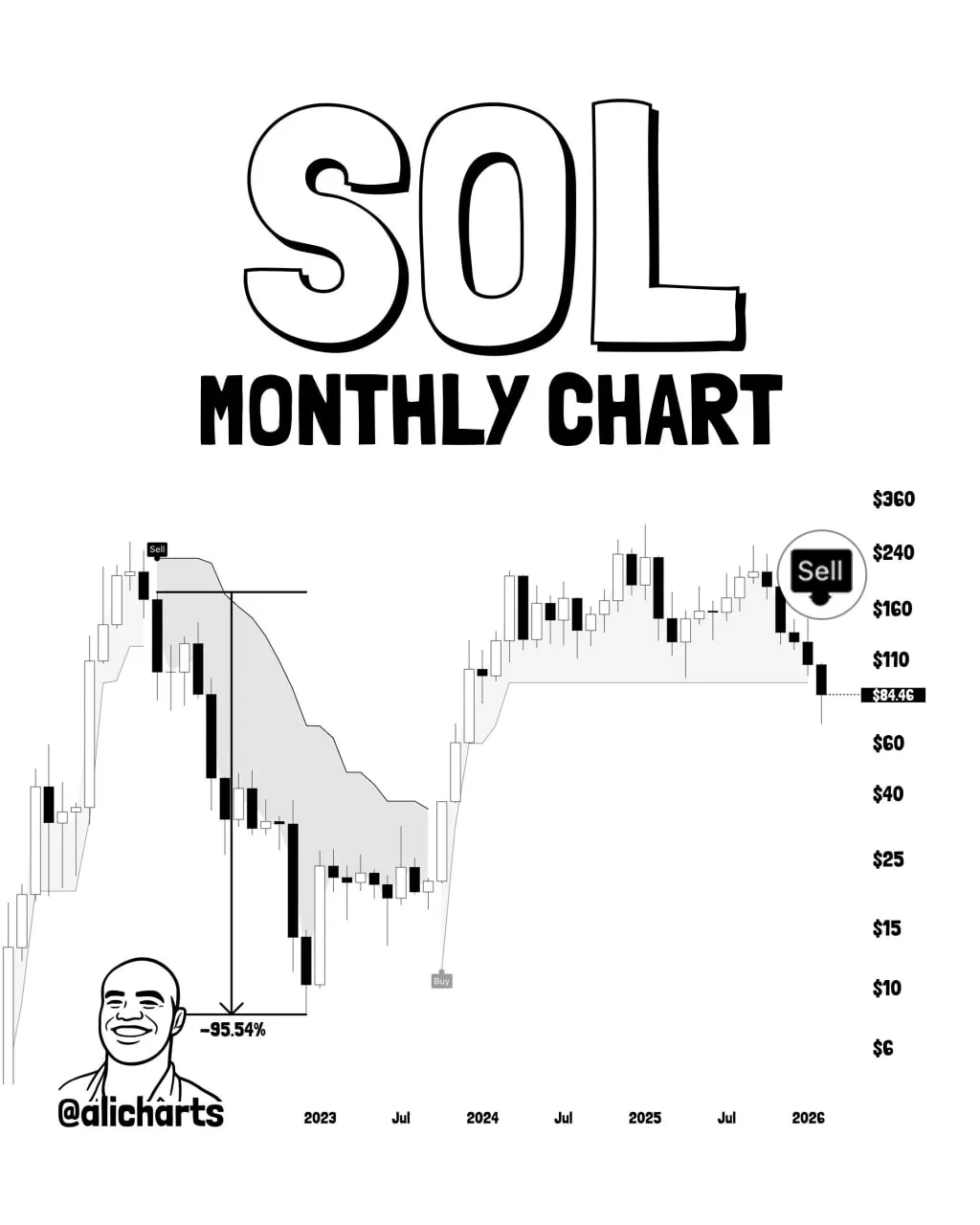
Solana $SOL Monthly Chart. Source: Ali Charts on X
On the chart, the recent structure mirrors the earlier cycle rhythm. First, price pushed into a high zone and printed a sell signal. Next, candles rolled over and began a sustained pullback. Because the prior cycle followed the same sequence, the comparison focuses on structure rather than timing. Therefore, the question centers on whether this pullback remains a standard cycle reset or develops into a deeper trend shift.
The visual also shows a long base that formed after the prior collapse, followed by a strong recovery phase. That sequence matters because the current structure now sits at a similar point in the cycle path. As a result, Ali Charts frames the setup as a repeat test of cycle behavior. The chart does not confirm outcomes. Instead, it highlights that the same signals and structure have appeared again, which puts the focus on how price behaves as this phase unfolds.
Read the full article here